Practice portal › Thermal Properties of Matter › Latent Heat and Change of State
Asked in CBSE AIPMT 2012 · Temperature vs heat-supplied graphs
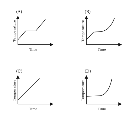
Given: liquid oxygen at 50 K heated to 300 K at 1 atm, heat supplied at a constant rate.
Idea: while the substance stays in one phase the heat raises its temperature; while it changes phase the heat goes into the latent heat and the temperature holds still.
Constant heating rate (dQ)/(dt)=P gives (dT)/(dt)=P/(ms), a constant, so each single-phase stretch is a straight line.
Stage 1: the liquid warms from 50 K to its boiling point along a straight line.
Stage 2: the liquid boils, and the temperature stays fixed while the whole sample vaporises, giving a horizontal step.
Stage 3: the gas warms on towards 300 K along a second straight line, less steep or steeper according to the specific heat of the gas.
A rising line, then a plateau, then a rising line: that is graph A.
Reading this solution needs no sign-in. You only sign in to practise against the clock and keep your progress.
Practise this with a timer